Logo Design Process
- Catherine Dwelley
- Mar 26
- 2 min read

For the logo process, I always start with some keywords. In this case, I considered what COMMN is all about. The goal is to connect college students with food resources, but also to reduce stigma and build a sense of community. I created several mind maps around these ideas, focusing on ideas that felt like they could be translated visually.

The next step is sketching. I looked at the name COMMN, and considered how the letters fit together. I explored ideas of community and connection, building blocks, and people. I noticed how the letters CO fit together, almost like overlapping plates, which lead me to the idea of a table. I didn’t want to get too explicit with the idea of food, so COMMN will have room to grow into other resources in the future.


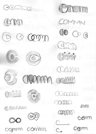


Next, I did another round of sketching, focusing on the ideas that worked best in the first round. I brought these ideas into Illustrator and built a wordmark. Critique indicated that the sketches with curves rather than points and straight lines were working best, so that is where I focused the most of my energy. I moved back and forth between icons and wordmarks.


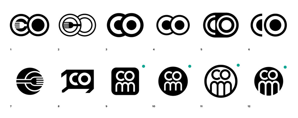
Finally, I landed on a mark with two circles from CO that look like overlapping plates, but when stacked on the MN from the wordmark, look like two people standing text to each other. I felt this mark encapsulated the different aspects of COMMN well. The second mark I looked at was a plate and fork that looks a bit like a flower when turned on its side. I thought this had some interesting graphic potential. I also chose several more possibilities, and ran them through Google image search to make sure I didn’t inadvertently plagiarize another logo.


Comments