Type and Color
- Catherine Dwelley
- Apr 2
- 2 min read

This week, I worked on refining the type and color of my visual system. Although I felt the color scheme I originally chose was effective, I found that it was way too similar to a previous project I had worked on last year. I don’t want to fall into a trap where all of my work looks identical, and that would definitely be an issue for brands too! I also simplified my colors, removing the gradients, and limiting to six colors plus black and white. Two of those colors are more neutral as well, and the new options feel more balanced.

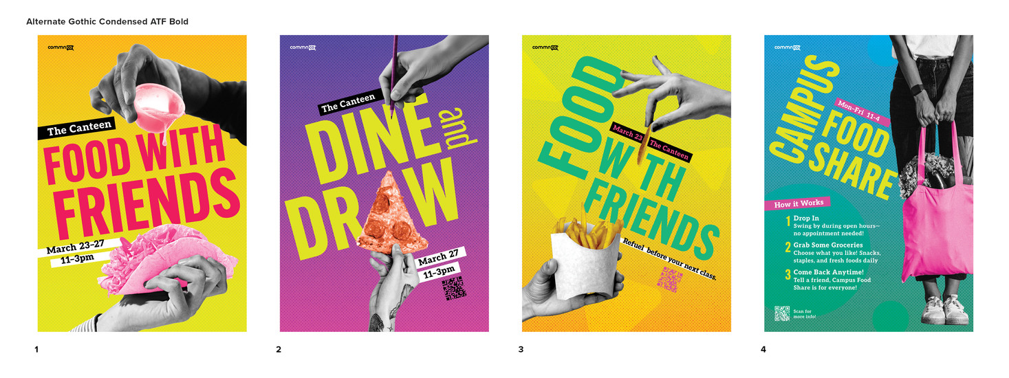


In addition to colors, I also experimented more with type. I wanted to inject a little more personality originally, however at large scale, the typefaces I had originally chosen had sort of a tiki look, and that was not where I wanted to go. I ended up looking through every condensed and compressed typeface on Adobe Fonts. Due to critique from last week, I was able to really identify what about each typeface wasn’t working for my project and why. One of the biggest issues was uneven type color. There was some unevenness to some of the glyphs that made the text look off in large point sizes. The W was a particular culprit. As I went through each typeface, I found this to be a common problem.

Eventually I landed on about 20 faces, printed out samples with my headlines, and sorted through them again. I picked four from those and used them in the poster layouts before landing on Rama Gothic M Bold designed by Ryoichi Tsunekawa from Dharma Type. The forms are based on vintage wood type, and feel a little retro (but not tiki!). I like its large x height, balanced letterforms, and while it’s condensed, its still very legible and doesn’t feel too squashed. I also love the shape of the R. The leg has a slight curve to it that adds personality without being too distracting.


Comments